
The most pressing question of this turbulent age is surely this: can you fit more grapefruit into York Minster, or York Minsters into the Grand Canyon? This blog is about questions which have answers, how we can think about estimating things, and whether any of this makes sense.

On the evening of October 26th I was sat with my friend and respected historian of 20C Britain, Sam Wetherell, in a Glasgow restaurant. Jist Misto is probably best described as a fusion restaurant. It features America themed burgers. One of them is the Grand Canyon burger, which we both ate. For reasons which are now totally lost to the imperfections of memory, Sam wondered aloud how many grapefruit would fit in York Minster. This certainly seems to be a question which has an answer. And then, following this, perhaps somewhat obviously – how many Minsters can we fit in the Grand Canyon. Which number is bigger?
In order to unpack, or perhaps pack, all this, I’ll take us through some estimates, refine them, and then reflect on what the point of this absurdist exercise is. There is definitely a point.
First, grapefruit. What is a grapefruit? In lieu of expert knowledge on the subject, Wikipedia usually suffices. This is a good time to extol the virtues of Wikipedia. For a while after its launch in 2001 it was probably a little unreliable, but things have changed. Moderators have been hard at work for the last 17 years and it’s now a valuable resource, especially for information that people would have no good reason to fake. I trust the grapefruit numbers. They are between 10 and 15 cm in diameter, which is a radius of 5 to 7.5 cm. Assuming they’re spherical, we can use V=4/3 π r³ to get the volume. The upper and lower radius values mean volumes differ by factor of 3.4 different, so we’re already operating in quite a wide margin and we haven’t even begun to think about York Minster. Let’s opt for the middle of the range and go with 6cm radius for a grapefruit. This gives us a volume of roughly 900cm³ – which is about a litre, so far so good.
It turns out there is a great deal more information available about grapefruit, for the avid reader. A grapefruit has an approximate mass of 200g (a weight of 2 Newtons). This will be important shortly.
Converting between cubic centimetres and cubic metres requires dividing by 1,000,000 (which is 100 x 100 x 100). The task now should be simple (although it isn’t): calculate the available volume of York Minster and divide by the average volume of a grapefruit. Using the value we calculated above, we have the average volume of a grapefruit as 0.0009m³.

I got in touch with York Minster. It doesn’t know its own volume.
I suppose this is not surprising, I don’t know my internal volume either. Happily enough people have measured its dimensions approximately. York Minster is Northern Europe’s biggest gothic cathedral. Roughly, it’s 160m long, 76m wide and 26m high to the vault. There are towers, and the fact that the building is a cross shape, and the horribly complex internal structure, but let’s just see what number we get using those dimensions first. The product of these dimensions is 316,160m³. So, dividing this by the grapefruit volume, we get a grand total of 350 million!
But, we should also consider packing fraction. All those stacked grapefruit don’t fully occupy the space they sit in. And, which is worse, the packing fraction depends on how well you arrange them. The best we can possibly do is around 74% of the volume. So we could reduce the maximum number by a factor of ¾. This doesn’t really compete with the uncertainty in the size of the grapefruit. If you studied the link above you’ll have seen that grapefruit are really oblate spheroids – and these pack slightly differently to spheres, as discussed here. But if we opted for grapefruit which were pre-selected to be 12cm in diameter, we’d get 74% of 350 million in the cathedral – around ¼ of a billion -That’s about 3 grapefruit each for everyone in the UK. Breakfast is sorted.
Incidentally, around 5 million tonnes of grapefruit are produced annually – around 25 billion of them! We have enough for 100 minsters full, but this wasn’t the question.

So, on to Minsters in the Grand Canyon. This calculation is almost impossible a priori, but luckily the Grand Canyon considers itself important enough to have an estimate of its volume. The national parks service website suggests “The volume of the Grand Canyon is estimated to be 5.45 trillion cubic yards” . I don’t know who made this estimate, but we’ll go with it. This is 4.2 trillion cubic metres. Dividing this by the approximate volume of the minster gives a mere 13 million! This is obviously a massive overestimate of the packing fraction, since minsters are complex structures, and I’d guess do not stack well. Even so, this is dramatically fewer than even our most conservative grapefruit-in-minster packing estimate, which would be around 100 million if we randomly packed the cathedral with large grapefruit. So there it is. If we took into account the towers, that would make things worse for the minsters. The grapefruit have it, the grapefruit have it.
Or do they? Let’s move away from abstract forms and consider practicalities. How do we actually get grapefruit into the Minster. Imagine the scene. Here’s the Archbishop of York, atop a step ladder, carefully piling grapefruit in neat pyramids in the North Transept. They tessellate nicely, and up to about 6 feet he has no problems. But the further he goes the harder it gets. The roof of the Minster is still way off. Outside truckloads of grapefruit are souring in the mid-day sun.
The compressive force needed to burst an orange is about 400 Newtons. I know grapefruit are not oranges, but they’re not far off. Under the weight of 200 grapefruit the bottom one would burst. All stacked up they would reach a height around 24 metres. So, now, we’re 2 metres shy of the top and the bottom layer has exploded. Grapefruit juice is flooding the cobbles. We can now squeeze more in, but at what point are we no longer dealing with grapefruit, if they’re all mushed and festering? The Archbishop is knee deep in grapefruit juice. This will not do.
And this is all to say nothing of packing Minsters into the Grand Canyon. The totally facetious answer to how many Minsters would fit in the Grand Canyon is 1 – because there is only one Minster. But is the Minster even still the Minster if we move it to Arizona? Does moving it there mean it’s not York Minster any more? Is the answer 0? If we could replicate them, one by one, building them in York and shipping them over land and sea to America, how many could we do? Once there, they would stack very poorly – Minsters are far more compressible than grapefruit. After several hundred thousand years of hurling cathedrals into the world’s biggest canyon, the miles deep layer of rubble on the canyon floor is surely indistinguishable from a pile of limestone. Is anyone still counting?
This slightly mad gallop through the world of 3D object packing has, hopefully, demonstrated exactly why physical units are idealised and abstracted and do not rely, for example, on actually filling a space to understand its volume. The last remaining physical quantity that is governed by a reference unit, the kilogram of mass, is due to be replaced by an idealised quantity. Equivalent assumptions are implicit in all forms of social science too. Take elections for example. Polls are now so heavily over analysed that it’s easy to lose sight of the fact that model building, idealisation and the practice of prediction are built on a great many assumptions. People are wildly more complex than fruit. This is often characterised, incorrectly in my view, as uncertainty in election forecast models. One of the key implicit assumptions in election prediction is that there exists some meaningful measurable quantity – just like a grapefruit’s mass – that can be elicited from voters prior to the election. It’s not just that the polls are often wrong, or uncertain, it’s that people are not static measurable objects. Despite recent attempts to characterise humanity as a mechanistic ensemble of preference adopting programmable automatons, we cannot be packed liked grapefruit. Even grapefruit can’t be packed like grapefruit, as the Archbishop surely knows.
(all the pictures are from Wikipedia, thank you to MatzeTrier – Own work, CC BY-SA 3.0, https://commons.wikimedia.org/w/index.php?curid=7305844 and Chensiyuan – https://commons.wikimedia.org/wiki/File:Grand_Canyon_view_from_Pima_Point_2010.jpg)
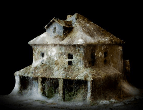 The incredible mould-as-art of Daniele Del Nero. The UK housing stock is in desperate need of renewal.

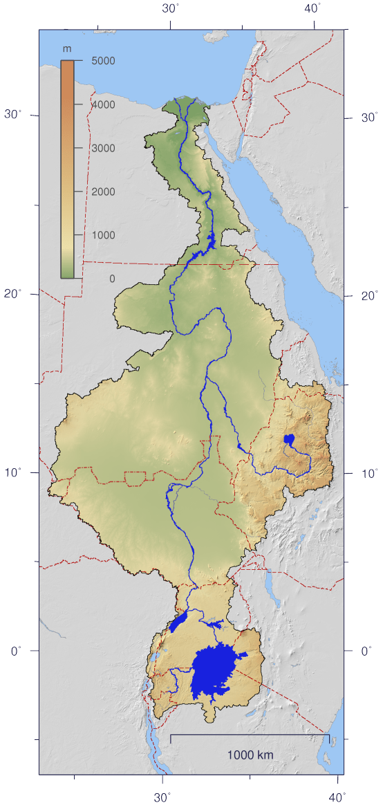 This is a map of the Nile and its drainage basin (

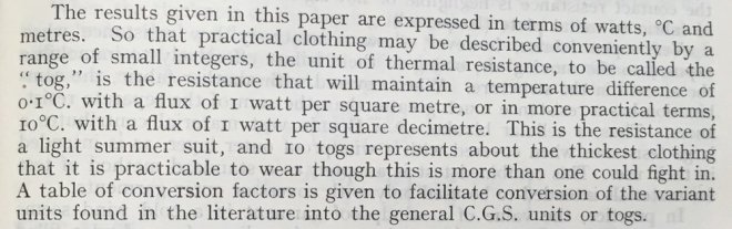 The first description of the tog. The transmission of heat through textile fabrics – part II’ p.343 by F. T. Peirce and W. H. Rees Shirley Institute Memoirs, Vol XXII 1944-1945
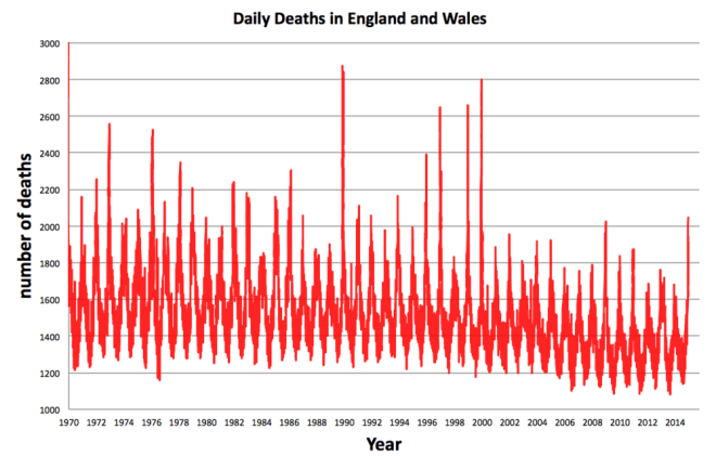 Each one of the 25 million deaths in England and Wales between 1970 and 2014. Source: ONS
